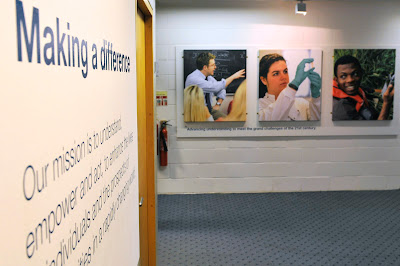
It was one of those more quirky meetings. Having been requested to gather in the Registry reception at the University of East Anglia, Studio soon learnt that our client wished to redecorate and get something more interesting on the walls. "It hasn't changed in twenty years, we have a good budget – have you got any ideas?". Not 'alf.
Anyone familiar with the University can instantly recall the grey concrete, so my first suggestion was to paint the reception white and turn it into a proper gallery space. With big photography. In five minutes everyone was agreed and Studio was then charged with making it happen. By July 31st please.

Although loving a challenge and a deadline, for this project to be successful it would have to be a collaborative endeavour. And talking with friends and colleagues I could only describe my own brief as being 'Tate standard'. It was the main reception at the University, so it had to be perfect. Andy Crouch, photographer, Who fan and fellow Studio dweller recommended Spectrum Photographic in Hove, Sussex. They could produce our prints at a massive size and 'Tate' like too.
And they were great. We researched various print formats, my fave being a C-Type print with a satin finish and mounted onto an aluminium base. Costly but cool. But finally the client settled on canvas as it was cost effective to produce new prints in the future thus keeping the Registry fresh.
I opted to work with Andy to resize the original images, colour balance and the other stuff that photographers do (they speak their own language, don't they?!). I worried about getting my measurements right. And Klair at Spectrum managed the project her end from production to delivery. Only trouble was that the courier lost them between Hove and Norwich. That caused a few heart stopping moments, I can tell you. But thankfully, they magically turned up on a sunny Monday morning. Sweet relief.

So here they are. With thanks to Klair, Helen, Andy and David for signing the cheques.
Visit Spectrum here - they are superb.

3 comments:
I spent many an hour in that reception area, way back when. It's good to see it looking so good!
Great idea, makes the recpetion look interesting and visitors will have something to look at rather than the tired magazines that you usually find in receptions!
Post a Comment