Tuesday, 1 December 2009

Neville Brody: Wanker or Genius – The Verdict.


Another unmissable event in the D&AD President's Lecture programme and provocatively entitled too. But it was all part of the fun and refreshing to know that while Neville Brody takes his role seriously as a designer in society, he can see through the facade of being regarded as a design celebrity.

The other widely reported quirk to this evening was the usage of twitter and its invitation for everyone to participate and ask questions with the all important hash-tag. Our host for the evening, the ever-readable Adrian Shaughnessy, keeping Neville on topic and occasionally browsing the tweets for those emperor-baiting questions.

And Studio intern Scott got the first question! He asked:


A valid question and one that perplexes most students, frustrated by choice. Neville stroked his chin and answered that "you can never have enough chairs" or "everyone should have their own font". For a designer famous for creating his own fonts, he would hardly restrict himself to his favourite three. Plus, mostly his letterforms are hand-drawn, like his recent title sequence for the film 'Public Enemies'. He gives good font does Neville.


The work exhibited was all recent examples from his Research Studio. Which was cool considering he could easily rely on the legacy work of the 80s - The Face and Arena magazines pretty much define the era. And here is where the theorizing began and much more chin stroking. Neville really needed a whiskey to complete the picture. He feels the decline of popular culture and societies use of design began with Thatcher, Reagan and Haircut 100. Seriously, this must have amused and befuddled the youngsters but this stuff could help your Critical Studies. For the record, he remains deeply suspicious of the Tories and fears the worst if Cameron gets into No.10 next year.

He is also frustrated by the way design is taught at art college. That there is too much focus on aiming for a career and not enough time to nurture creativity, stating, "college is to nurture your soul - your convictions". OK, but the times haven't changed that much. I went to art college to learn a trade and obviously graduates want jobs. But I do agree, there are too many graduates competing out there. But like all great thinkers, there was an element of self-contradiction. Neville thinks there should be 100% creativity and 100% skills. So, learn flash.


After Adrian branded a heckler a wanker it was our time to vote. The audience was all given voting cards, each to hold aloft in Apprentice style. And like a suited Dermot O'Leary I can reveal the result. From my seat it was 65% Genius / 35% Wanker.


Nicely done D&AD. Visit Research Studio here.

PS. Neville considers himself a genius because he is a Spurs Fan. And all you Arsenal supporters say... ?

Monday, 16 November 2009

D&AD President's Lectures: Making It Big with Paula Scher


When The Clash first visited New York, they said when they looked out the car window it was like seeing a movie. And as a kid raised on American cop shows in the 70's, I can understand that (favourite show: Hill Street Blues). But what about the influence of NYC on graphic design?

As most Graphic Communication students may tell you, I bang on a lot about european design; I think of myself as very much a european designer. But what about american design? Well, when ever I imagine the design consumed by the cast of Seinfeld or the officers in blue on the Hill, it was always the work of Paula Scher (with great respect to Milton, Bob and Paul). I was really excited to hear Paula talk about her work, especially in her irresistible accent. And she did not disappoint.

This will please fans of The Beatles - her earliest influence was the cover of 'Revolver' and its swirly illustration by Klaus Voormann. And that is significant as she describes her work as decorative and the exact opposite to the precision of 'boring' swiss design. Although her talk was mostly a greatest hits resume of her career, I liked the fact she is not defined by her earliest work, when she was fancy free in her twenties. And she designed record covers back then, freely admitting that while designing 150 covers a year for CBS - she only felt six truly represented her true potential. But she found the creative freedom and confidence to create good work at Pentagram.


Paula likes BIG type - it literally shouts of the page. Her poster work for The Public Theater is jammed with information. But just as designing simply is more difficult than it looks, going for typo overload also takes great skill and control.

She has a hang-up about helvetica. Her design communication is guided by a social and political conscience. But let's hear from Paula herself. Environment is also important - here she is on NYC:


Paula is constantly going forward and excited at the prospect of what she will create in her sixties. So there's hope for all of us woeful late developer's out there.

Enjoy a Pop Life


The rain may have poured but it was all sunshine and good vibes inside the Tate Modern. It's currently staging the exhibition 'Pop Life' and boy did it put me in a good mood.

Featuring the selected works of Andy Warhol, Jeff Koons, Damien Hirst, Tracey Emin and Takashi Murakami it was all feel-good colours, fun-loving and very saucy too. Pop Life takes the Warhol quote 'good business is the best art' and reveals the crafted persona of these artists as brands. There's even a Pop Art Shop in the middle of the show - with a great disco. But mostly, I thought it was all just good fun. From Warhol advertising TDK to Jeff Koons getting fruity as a viril adonis - you can't help but shyly smile.


The best for me (and the most fun) was found in the final room and it was like stepping into a Japanese playroom, only imagined by Takashi Murakami. Look up at a vibrant 50ft high manga character fitting perfectly into the streets of Tokyo. Then you hear the mad pop music - is that Spider-man's girlfriend? Yes, it's Kirsten Dunst in a cyan wig singing 'Turning Japanese'. Delightful. And what better excuse than to post lots of pictures of Kirsten.


Enjoy Pop Life until January 2010.

www.tate.org.uk

Tuesday, 10 November 2009

And Finally - What on Earth Has Studio Been Up To?


Firstly, big apologies for the delay in updating the Studio blog. It's been a busy few months. And I'm not just saying that. But one confession - I have been distracted by twitter.

Loads of news, but where do I begin?


In August Studio took on the tenancy of Rigby's Court which was very exciting and I immediately treated the new Studio space to one Charles Eames and a Wassily chair for visitors. Plus, our new intern Scott Robinson began work here and instantly settled in. A recent graduate from the Norwich University College of Arts, Scott is keen to explore digital work. The NUCA internship scheme is worth supporting and gives graduates their first valuable step on the ladder toward employment.


Late September, I was re-united with the tall, curly haired Andy Campbell and gentleman of the industry Selwyn Taylor and together plotted the first term of the Graphic Communication course at NUCA. But first we sought to be creatively enriched by the D&AD Xchange conference. Must say, in the beginning the atmosphere was a bit sombre with too much talk of recession and not enough positivity to inspire us to work smartly despite it. Plus, the over-used term '360 degree skills base' really grated on me.


I got over it. And working my way through the numerous tea breaks, the fun began with Damon Murray and Stephen Sorrell of Fuel. Quite an arty pair these guys (their next door neighbours include the Chapman brothers, Gilbert & George and Tracey Emin) and not your conventional graphic designers but still love to work with image and type. Publishing their own magazines, their strange leftfield view of the world was soon appropriated by the ad industry with commissions for Virgin and Diesel jeans, which funded more ambitious projects. They love creating books, whether it's documenting Russian criminal tattoos or post war football programmes.

What I found the most rewarding was hearing about a different way of working; creating inter-grated brand campaigns which embrace social networking to sustain public interest, way beyond the casual impact of a poster or advertisement. It got me thinking, 'is conventional design dead?'. I got over that too. Ed Elworthy of Nike walked us through a superb campaign, dedicated to urban five-aside football, its objective to nurture brand loyalty and a love for the sport. Encouraging local enrollment and ramping-up regional rivalry toward a championship event. Interest was stimulated by crude youtube movies featuring Wayne Rooney being 'nutmegged' by a teenager:


If football is not your thing, I'm sure Mark Chalmer of Perfect Fools could interest you in his Nokia Unloader, which promotes a business phone for a cleaner working life. What these dutch guys did was amazing and would have made Heath Robinson proud. Creating a fascinating contraption, which exists somewhere in Stockholm and within your reach online. Visit their site to upload all your useless documents and then watch them being destroyed in real-time. Thoroughly useless or useful? - you the consumer can decide. But how can you resist not to find out? www.the-unloader.com

That was ages ago - now back to my own design reality.


I'm currently planning the first Studio portfolio booklet which will be available in the new year. Featuring selected results from our first two years and lovingly printed on GF Smith papers. Details to follow. Anyway, I promise to keep the blog updated - the next month will see Studio attend the D&AD President's Lectures, featuring Paula Scher and Neville Brody. And let's not forget The Specials at Hammersmith Apollo and Paul Weller at the UEA.

Stay with-it.

Wednesday, 19 August 2009

Off The Wall


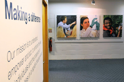
It was one of those more quirky meetings. Having been requested to gather in the Registry reception at the University of East Anglia, Studio soon learnt that our client wished to redecorate and get something more interesting on the walls. "It hasn't changed in twenty years, we have a good budget – have you got any ideas?". Not 'alf.

Anyone familiar with the University can instantly recall the grey concrete, so my first suggestion was to paint the reception white and turn it into a proper gallery space. With big photography. In five minutes everyone was agreed and Studio was then charged with making it happen. By July 31st please.


Although loving a challenge and a deadline, for this project to be successful it would have to be a collaborative endeavour. And talking with friends and colleagues I could only describe my own brief as being 'Tate standard'. It was the main reception at the University, so it had to be perfect. Andy Crouch, photographer, Who fan and fellow Studio dweller recommended Spectrum Photographic in Hove, Sussex. They could produce our prints at a massive size and 'Tate' like too.

And they were great. We researched various print formats, my fave being a C-Type print with a satin finish and mounted onto an aluminium base. Costly but cool. But finally the client settled on canvas as it was cost effective to produce new prints in the future thus keeping the Registry fresh.

I opted to work with Andy to resize the original images, colour balance and the other stuff that photographers do (they speak their own language, don't they?!). I worried about getting my measurements right. And Klair at Spectrum managed the project her end from production to delivery. Only trouble was that the courier lost them between Hove and Norwich. That caused a few heart stopping moments, I can tell you. But thankfully, they magically turned up on a sunny Monday morning. Sweet relief.


So here they are. With thanks to Klair, Helen, Andy and David for signing the cheques.

Visit Spectrum here - they are superb.

Thursday, 9 July 2009

Studio Stonehenge


Studio has been recently commissioned to produce trophies for Rapid Enterprise Competition 2009. And here they are.

We are very pleased with the outcome. Studio also created the branding, work books and certificates for an event which is similar to The Apprentice but for budding entrepreneurs in schools. Over 100 students took part from 8 schools and were mentored along the way by product designers and various work shops at Hethel Engineering.

The awards ceremony is at the Open venue in Norwich, Friday 10th July and Studio is looking forward to seeing the work of the winning schools. Nice to know that no one has been fired though.

Photography by Andi Sapey.
(With thanks to Spinal Tap for the post title)

Friday, 3 July 2009

Beyond the Wizards Sleeve


This is a cool part of the job. Having worked with our client on their latest design project, finally seeing it on press for one final approval is a thrill.

And the project in question is the 'Made in the University of East Anglia' booklet - from briefing, presentation, design and sign-off, it's been a pleasure to work on. You can tell that Studio is pleased with it. This was a good opportunity to document its time on press. No special finishes like varnishes or embossing - just good old CMYK, thus saving our client money to get it printed on a cool stock like Naturalis. The final booklet has a feel of lasting quality.


It's great to hear the loud print presses and the smell of the ink in the air. We maybe in the early years of a new age of digitaI, but I think print will always have a place, because we like to engage with an object and experience what the designer and client intended. In years to come it will occupy the same place in our hearts as vinyl records and will continue to surprise.

Many thanks to Jane and Jamie at Gallpen.