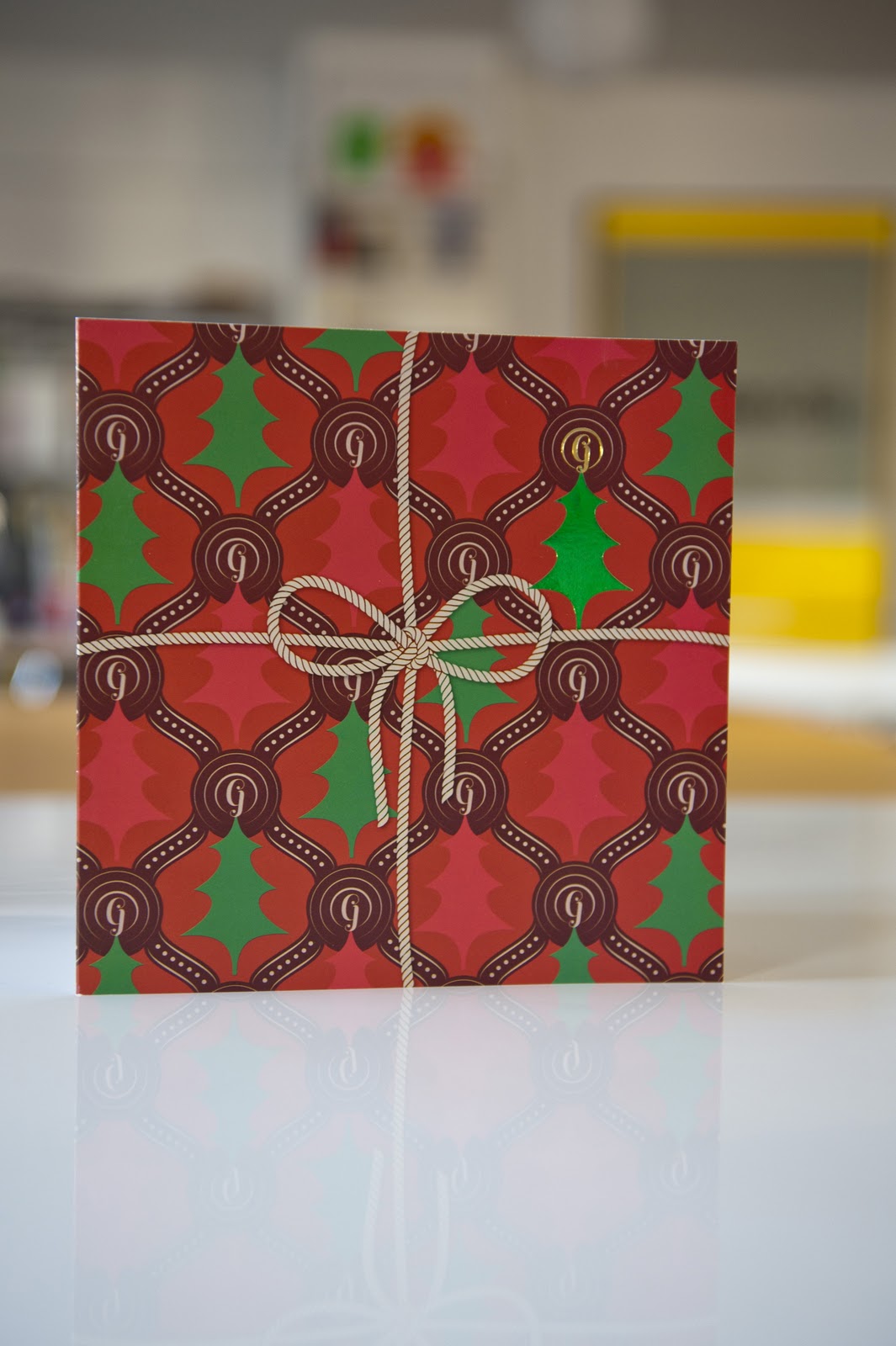
Earlier this year we had been invited to design this year's Christmas card for our printer Gallpen in Norwich.
Not an easy task, as there are so many cliches but I still prefer design to possess an idea and in this case, make you smile. So here it is, the jumper you never want but forever associate with Christmas. With more time and budget we could have had a few knitted and created something viral but I'm pleased with the classic end result. And being print, the front cover detail was foil blocked too.
Merry Christmas to all Studio clients, friends and collaborator's – all the best for 2011.
One of our favourite clients, Access to Music walked into the studio recently and announced, "I have no prospectus, I have no promotional materials and I have an Open Day in a couple of weeks – what can you do?"
After a considered sip of tea, and the offer from our client of a Disco biscuit, we suggested a newspaper. They are very much in vogue at the moment in certain design circles, and apart from their usual function as a carrier of news, the format had been rarely utlized commercially. We had already discovered Newspaper Club, a brilliant new printer who create cost effective newspapers and for short runs too. With our tea and the Disco biscuits finished, our decisive client gave us the green light to proceed.
Designed by NUCA graduate Billy Thorpe, who had just completed a successful Studio internship, Billy also recommended the illustration talents of another graduate Lauren Marina. It was one of those enjoyable projects which seemingly design themselves. But that's because of a great idea, and the momentum of a print deadline. And Newspaper Club only print every Tuesday at 2pm.
I love this project – Studio created a desirable object which would be irresistible to pick-up and take home if you are discovering a new university or college campus. But there was an added twist – during the project I attended the Future:Content design conference, organised by the good people of It's Nice That.
One of the inspirational speakers was Russell Davies, Head of Planning for Oglivy and Mather – who gave a brilliant talk on new methods of communication, the limitations of the screen and print finding a new purpose. I had a tingle when he told us he was the owner of Newspaper Club and how it was fun to re-purpose a format which the digital evangelists continually tell us is dying.
It's important to occasionally have a day out from the Studio.
And it's especially important if you're being culturally re-charged by seeing a new exhibition or hearing an info-rich lecture (Billy and Scott will be soon attending V&A talks by Angus Hyland and Neville Brody – lucky fellas). I recently visited Chelsea Space with photographer Andi Sapey to see the retrospective show of the work of designer Barney Bubbles.
Barney isn't instantly recognisable as Saville, Garrett or Farrow, maybe it was because he never put his name to his work. But his work was amazing, a real explosion of style which possessed charm and wit. And you find it in his work for Ian Dury, Elvis Costello, Stiff Records (and many, many more). I especially liked his numerous full page adverts for Ian Dury in NME. And the full set of wallpaper covers for his LP, 'Do It Yourself'.
For designers of a certain age and pedigree, it's a reminder of previous working methods. Here at Chelsea Space, you see all of Barney's original artwork, alongside the still-stuck-bromide, cow gum, rotring pens and air brush – the original tools of the designer's craft. Sadly, Barney died in 1983, before the arrival of the Apple Mac and its revolution of change. It's a shame because he would have had a riot with a Mac.
'Process: The Working Practices of Barney Bubbles' is a brilliant show and will hopefully open next year at the Norwich University College of the Arts. Certainly, Andi and myself will do our best to spread the word. Afterwards, we enjoyed a couple of drinks with Chelsea Space manager and curator Donald Smith – a lovely guy, who told us all about Jerry Dammers and various ex-members of Big Audio Dynamite and other characters in Barney's working life who had recently attended the Private View.
Please see the rest of Andi's photos of the show here. And, as a special treat, a couple of the rare videos Barney directed.
It maybe typically late, but Peter Saville, Ben Kelly, Paul Barnes and Matt Robertson have created an immaculate grave stone for Tony Wilson, the former head and self-proclaimed idiot of Factory Records.
Three years late in fact, as Tony died in 2007 but like most of Saville's work (and his collaborators), it was worth the wait. The black granite headstone features beautiful typography, a considered layout and a quote chosen by Tony's family, from 'The Manchester Man', a 1876 novel by Mrs G Linnaeus Banks.
Tony was no idiot and helped create a superb record label which nurtured creativity, eccentricity and independence. And the work left behind is timeless and a great example to any budding designer or musician.
Tony's resting place is in the Southern Cemetery in Chorlton-Cum-Hardy, Manchester. I must plan a pilgrimage in the near future. Here's Tony's favourite Joy Division track, 'Atmosphere' – and my favourite version from the Live LP 'Les Bains Douches'.
Sometimes the thought of Coalition government cuts in the UK make me more nervous than the recent recession.
Obviously, common sense cut backs are necessary to avoid the UK lurching further into economic meltdown. But to make more cuts to the Arts sector would be a mistake, given its vast contribution to the economy. The importance of the Arts has been illustrated here by this superb animation by David Shrigley - funded by the Paul Hamlyn Foundation. You quickly get the idea.
Here's a project to disturb the hornet's nest of graphic design commentary.
Peter Saville, purveyor of arty design (and creator of Studio's favourite LP sleeve, ever) has been commissioned by Umbro to design the new England football shirt. And it ticks all the classic Saville hallmarks – understated cool, colour-coded and divisive. I know little about football, but I do know that genuine fans care to an almost religious level. So this design project will cause quite a reaction.
I like it, but then I would. The shoulders of the garment are decorated in multi-coloured crosses of St George – which on a white shirt, are hard to spot from a distance. Apparently it was St Peter's original intention to cover the entire shirt, instead this will be a limited edition. Following his classic colour-coded typo for New Order's 'Power, Corruption and Lies', I wonder what these array of crosses spell out?
It's interesting to see such an iconic designer operating in an unexpected sector of design. But it's not the first time, as he previously designed New Order's World Cup single in 1990. Hopefully it will signal a change of fortunes for the England football team, as indicated by the recent success in its match against Bulgaria where players wore the shirt for the first time.
Here's Umbro's promo film:
And a link to Peter's recent interview on designing for such a 'potent symbol'. The comments section gives you an idea of the strong reaction. It reminds me of when pop stars such as Morrissey or Ian Brown have worn a football shirt in concert - a contingent of adoring fans suddenly scream for their blood.
You know how it is. You visit a gallery or an exhibition and the gift shop has a tremendous pull - time to look at postcards, books and stuff. After you've been culturally enriched, it's just nice to leave with a memento of your visit.
And so it was, with this year's BA Graphic Communication graduation show at Norwich University College of the Arts. Following the recent trend for design journals using a newspaper format (thank you Unit Editions) graduates had this additional platform for their work, and for visitors to enjoy as an irresistible freebie.
It did mean more work for third year student Billy Thorpe, who designed it at the Studio (with print sponsored by Archant). Everyone was pleased with the end result and Billy earned himself an internship at the Studio. Which was nice.
You may remember from the previous post that a fish tank was available to win from the graduate show at Norwich and D&AD New Blood. Interested visitors were encouraged to give their details to Andy Campbell or students on the stand. Studio can exclusively reveal that the winner was...(drum roll)... Emma Booty of Landor – a branding designer who covets supermarkets as our 'new church' and 'temples of temptation'. Congratulations Emma.